Open them on your phone. A portfolio full of mockups proves someone can design a picture of a website. A live URL proves they can build one.
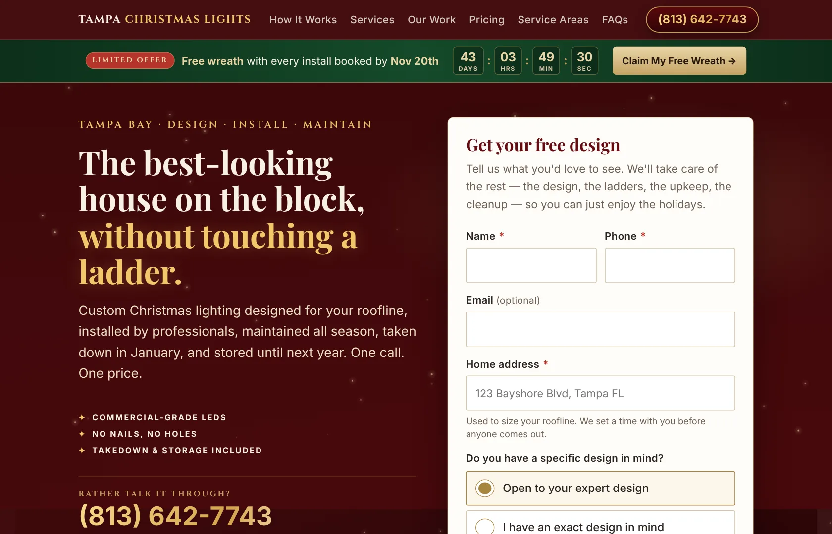
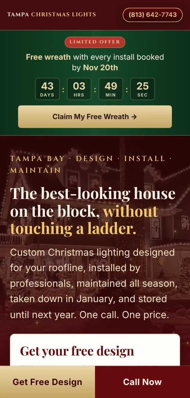
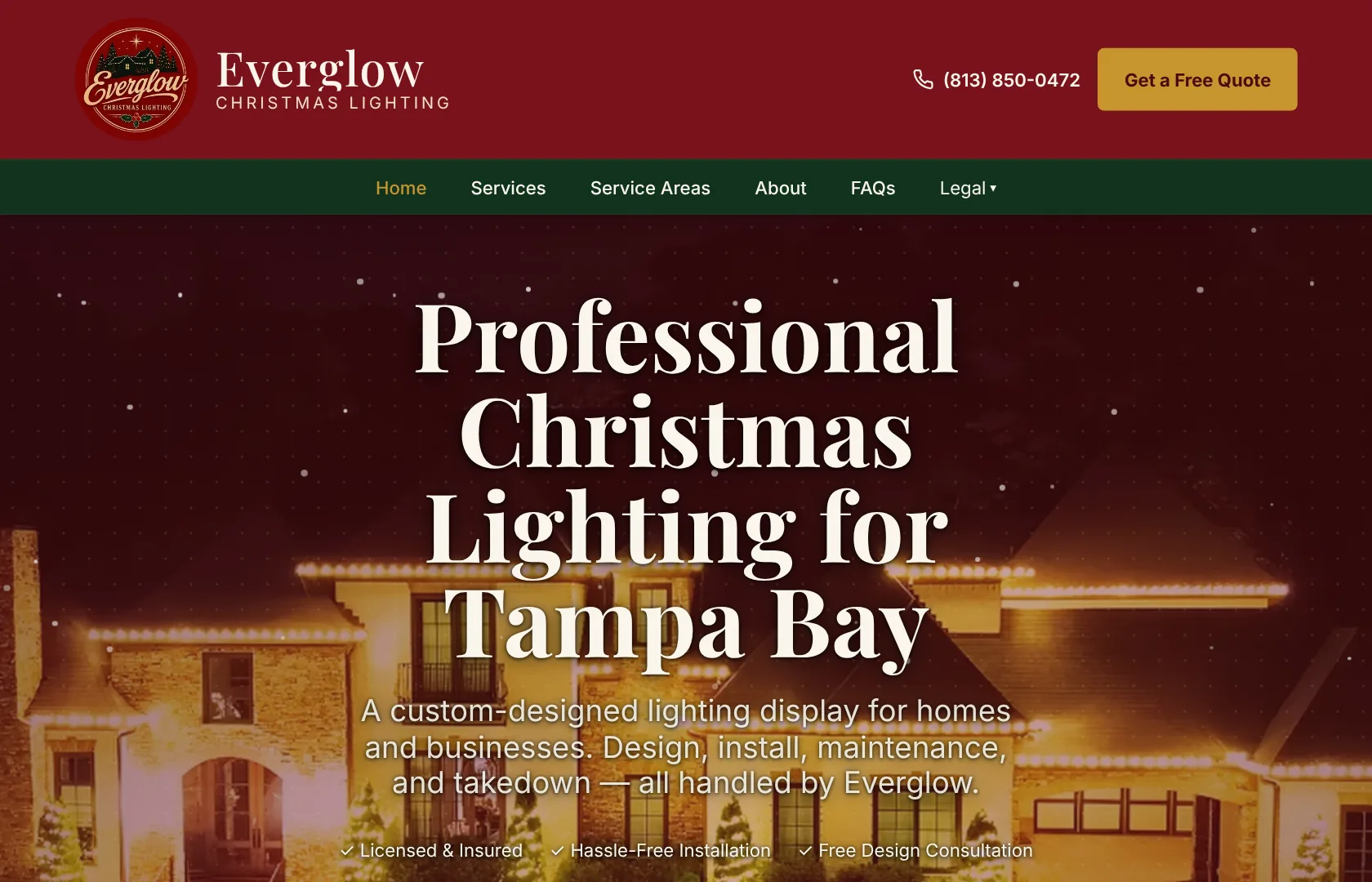
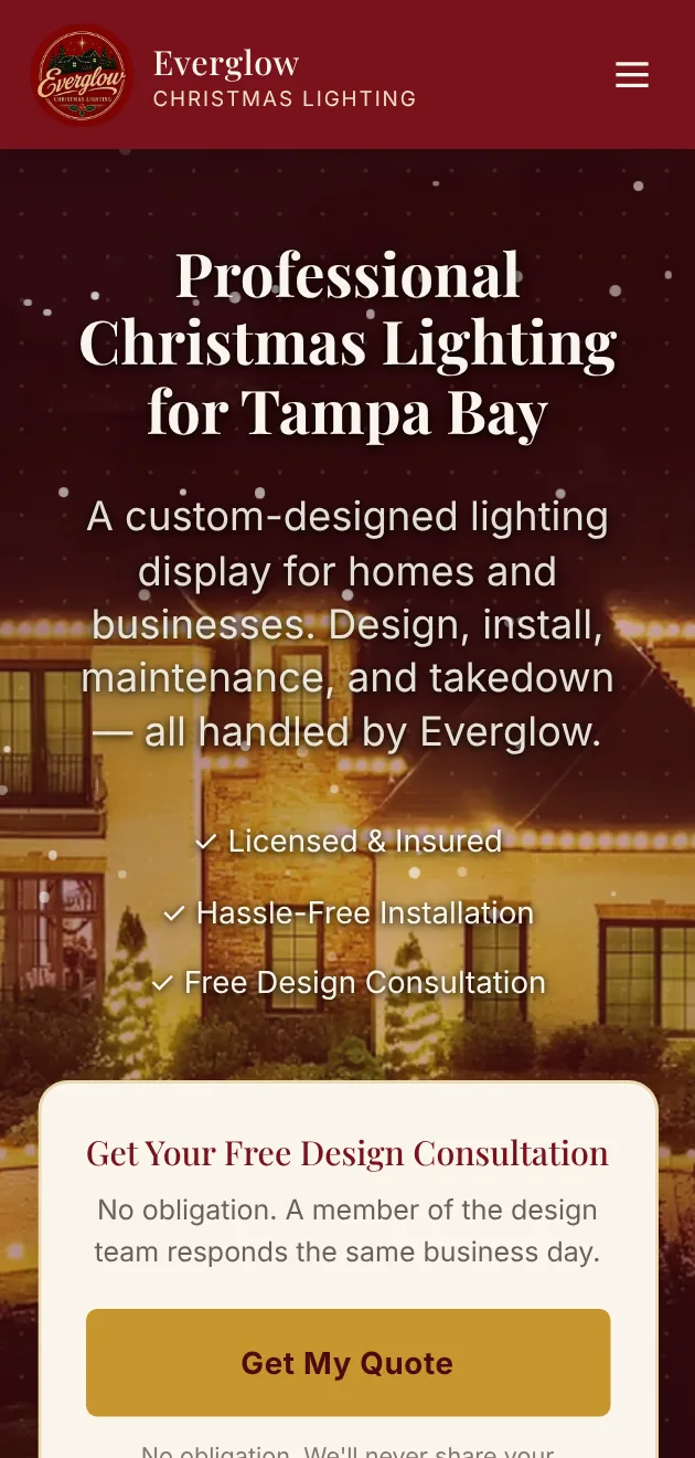
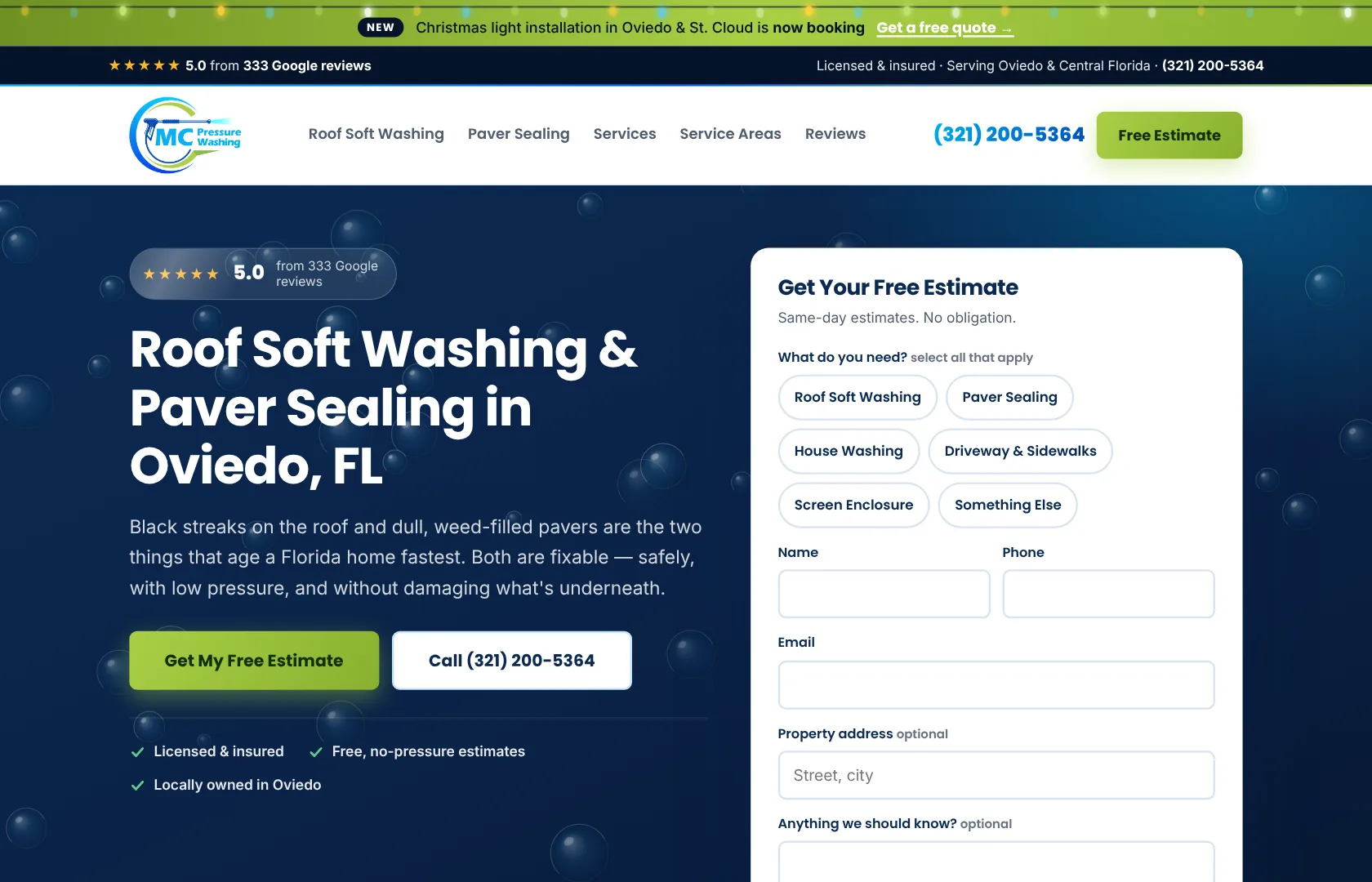
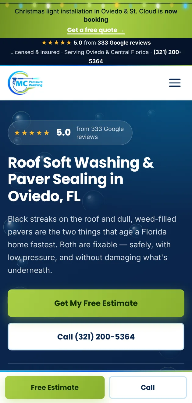
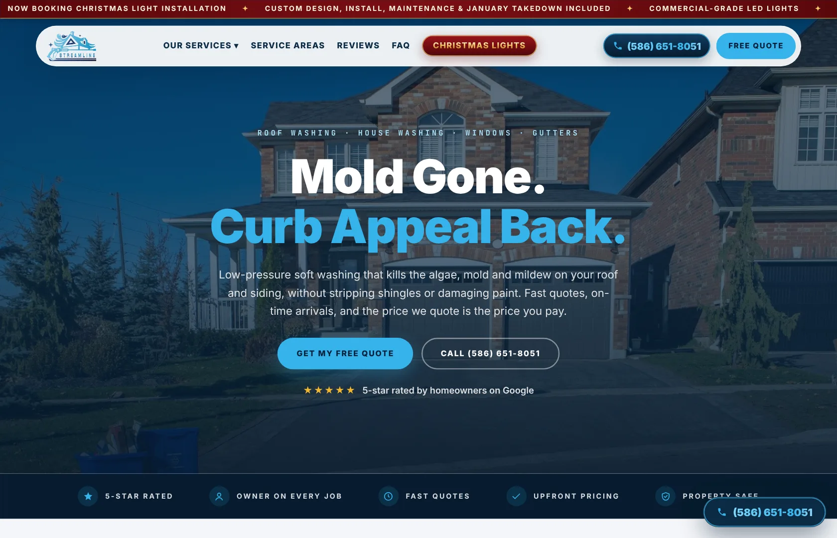
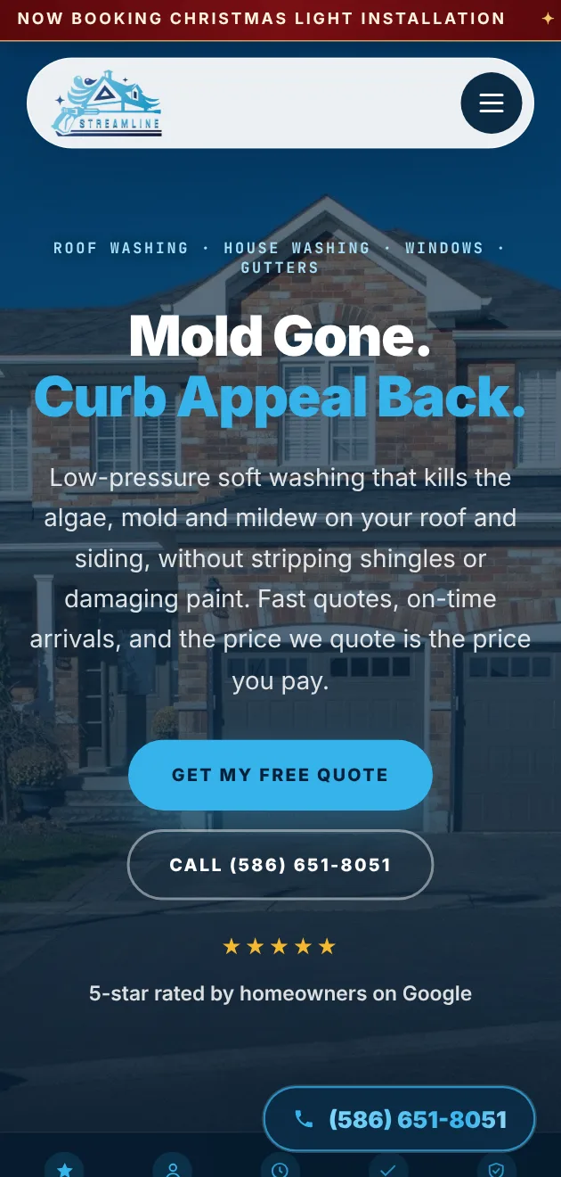
Every piece below is real client work, delivered print-ready and sized for the Vistaprint Pro shop.

Three lines and one phone number in a reversed bar. It works precisely because it refuses to do anything else. Legible from a car at speed, which is the entire job of a yard sign.


Front and back. A before-and-after that makes the problem obvious at a glance, the weekly service spelled out item by item, and both a QR code and a phone number so it converts whichever way the homeowner prefers.
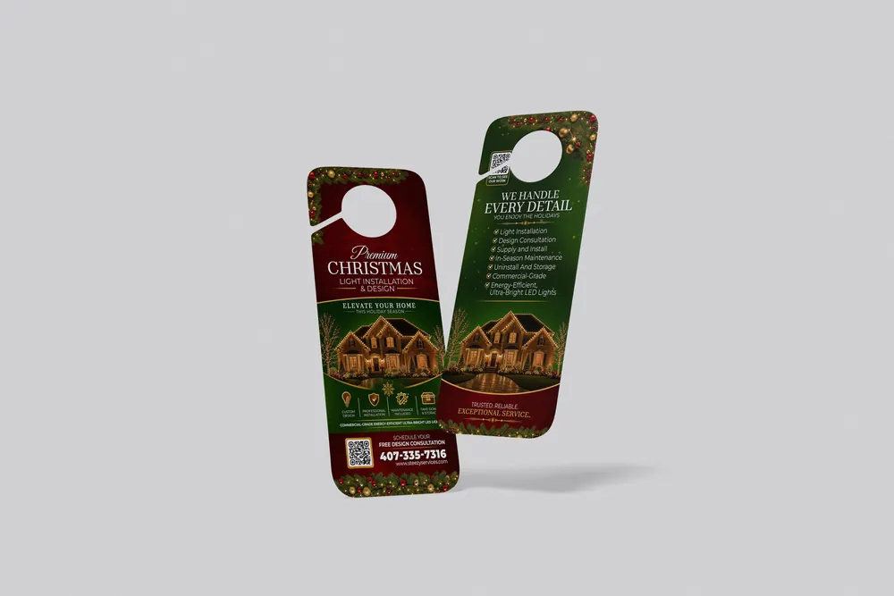
Deep green and gold, front and back, with the service list on the reverse and a QR code beside the number. Built for the piece a homeowner carries inside and sets on the counter.
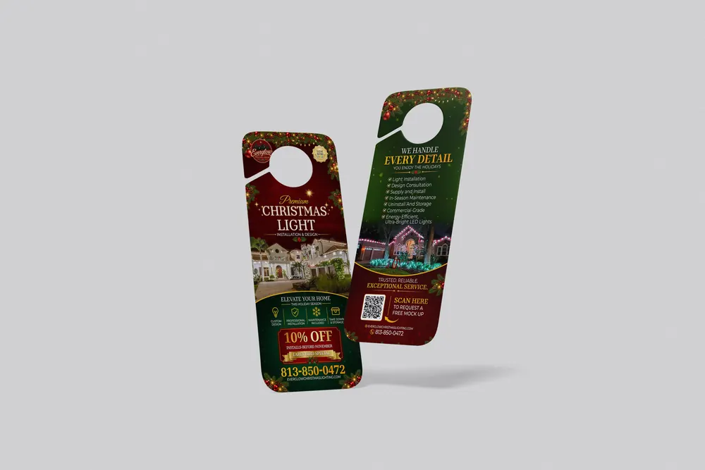
The house is the hero. Everything else — the checklist, the QR, the phone number — is arranged around it so the eye lands on the result first.
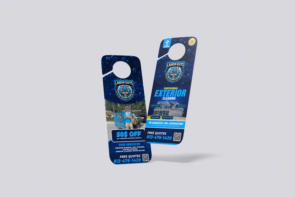
High-contrast blue with a real job photo on the front and the full service list on the back. Two ways to respond, both above the fold on each side.
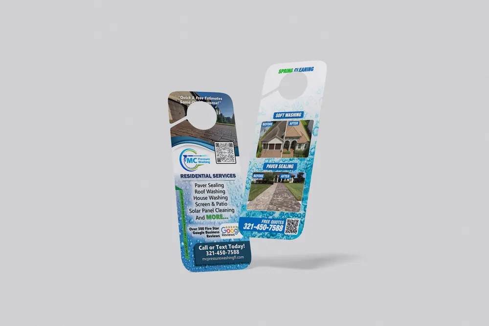
Residential service list on the front, before-and-after proof on the back. The review count sits next to the QR code where it does the most work.
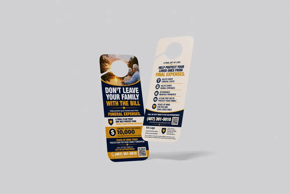
Not a home service — a reminder that the format works anywhere. Calm palette, one clear number, and a benefit list that answers the objection before it forms.
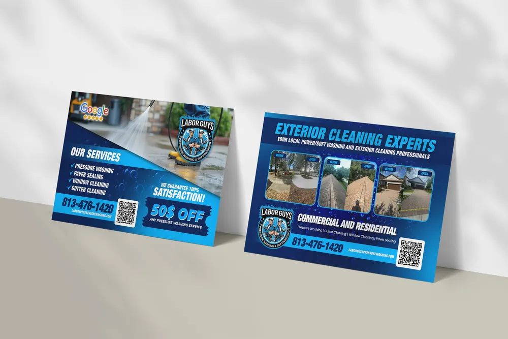
Front sells the outcome, back sells the range. Google rating on the front, three job photos on the back, one phone number on both.

Black front, red back. Installation, maintenance, takedown and storage listed plainly, because that list is the whole reason people hire out.
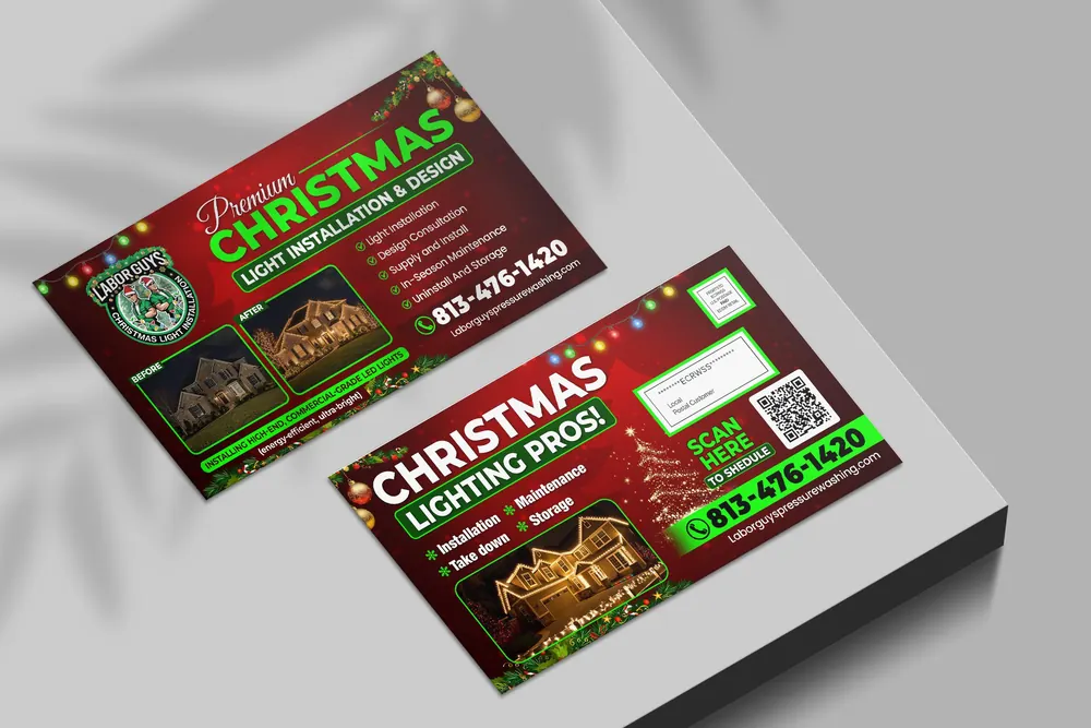
Before-and-after on the front and a mail panel on the back sized correctly for EDDM, so it goes out without a redesign.
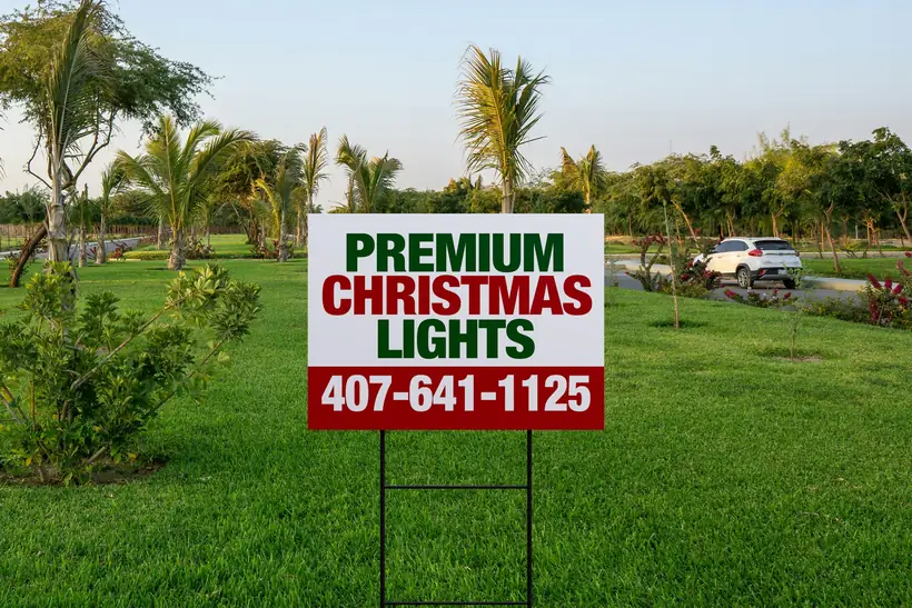
Three lines and a phone number. It works because it refuses to do anything else — readable from a moving car, which is the entire job.

A two-word question does more than a service list ever will at forty miles an hour. The question is the ad.
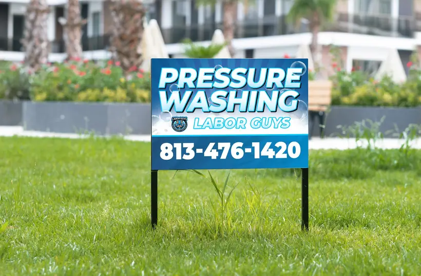
Service, brand, number. Nothing competes for attention and the number is the largest element on the sign.
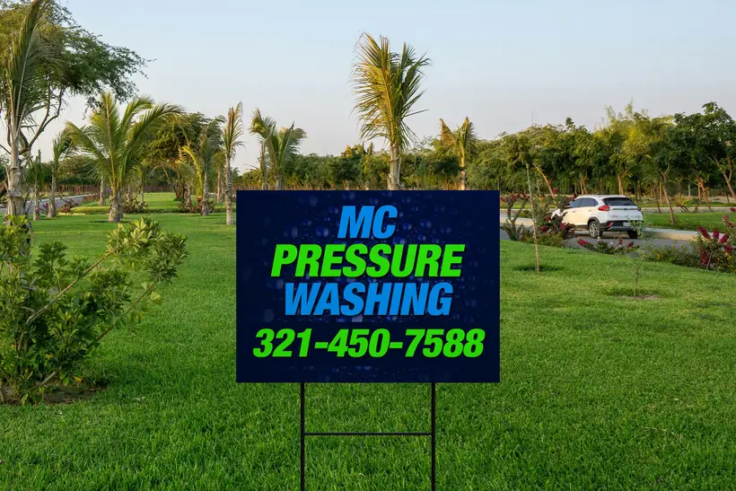
Reversed out of navy so it reads at dusk as well as noon, when a lot of these actually get seen.
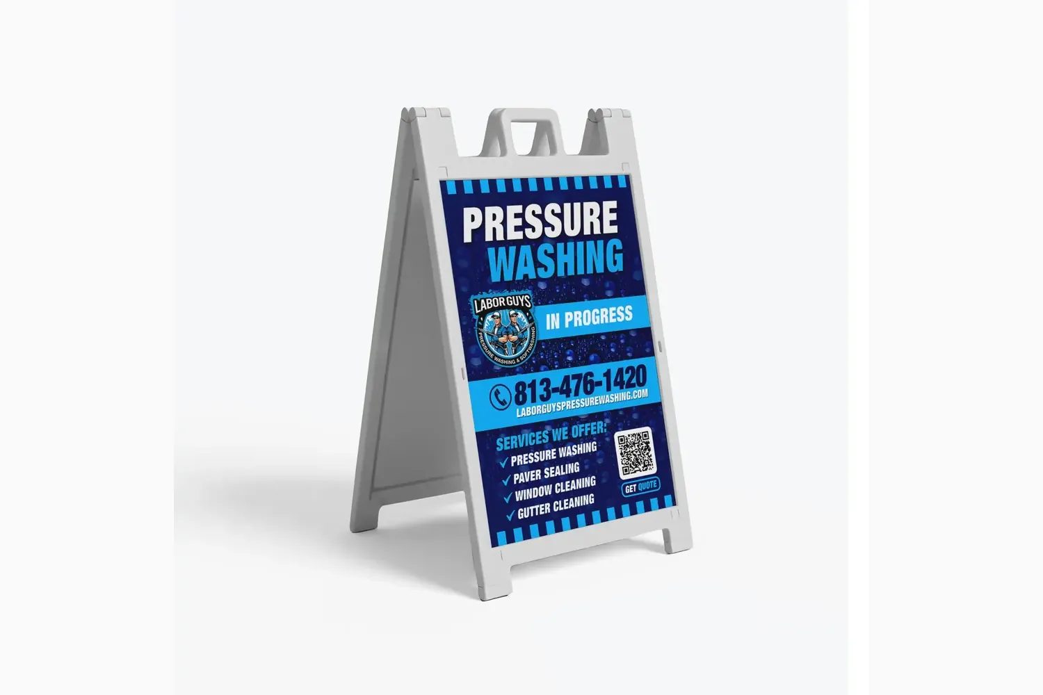
The on-site sign. Parked at the curb while the work happens, so the neighbours see the brand and the number at the exact moment the result is visible.
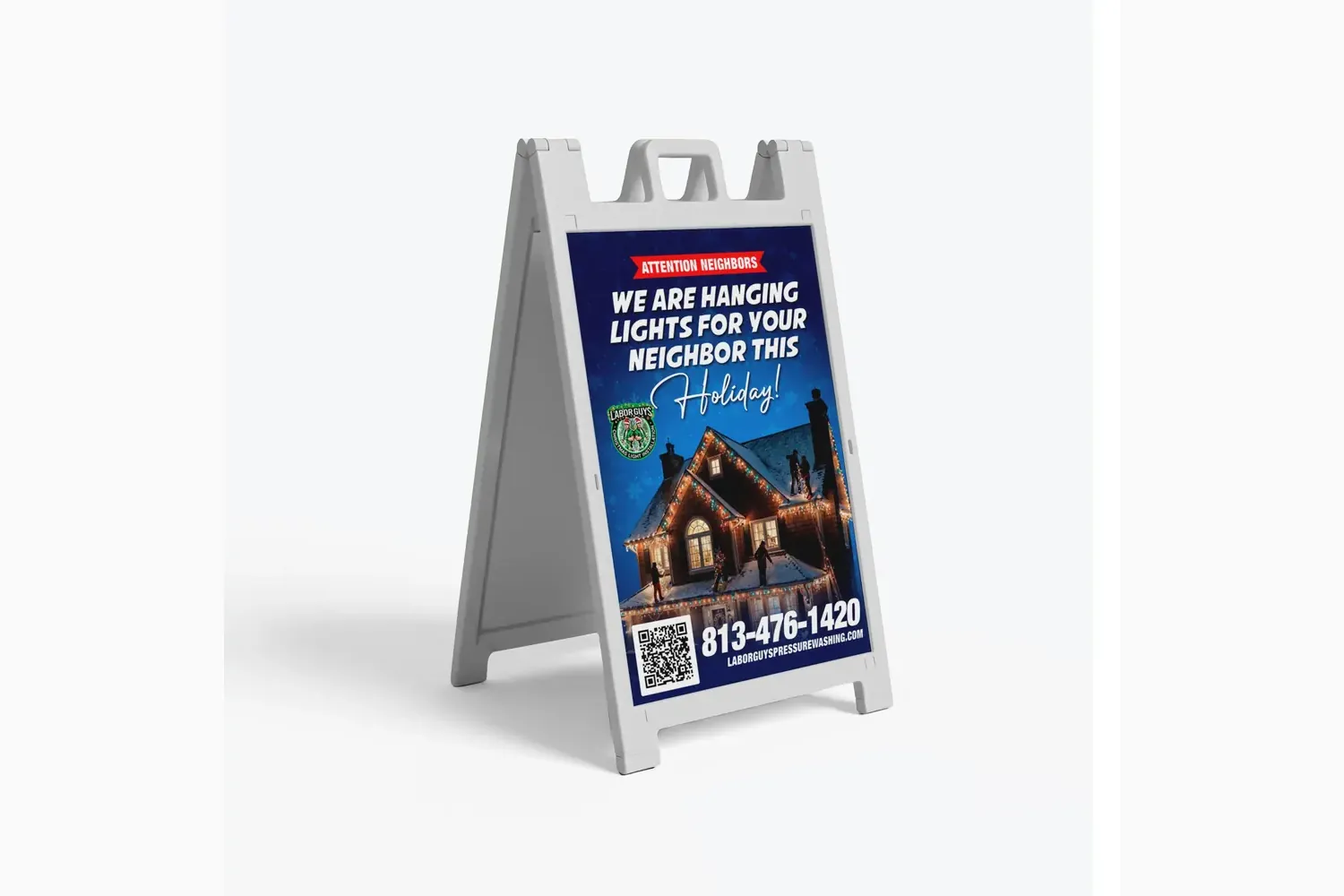
Route density in one sentence. It only works because the crew is already on the street, which is the whole point of working a neighbourhood instead of a city.
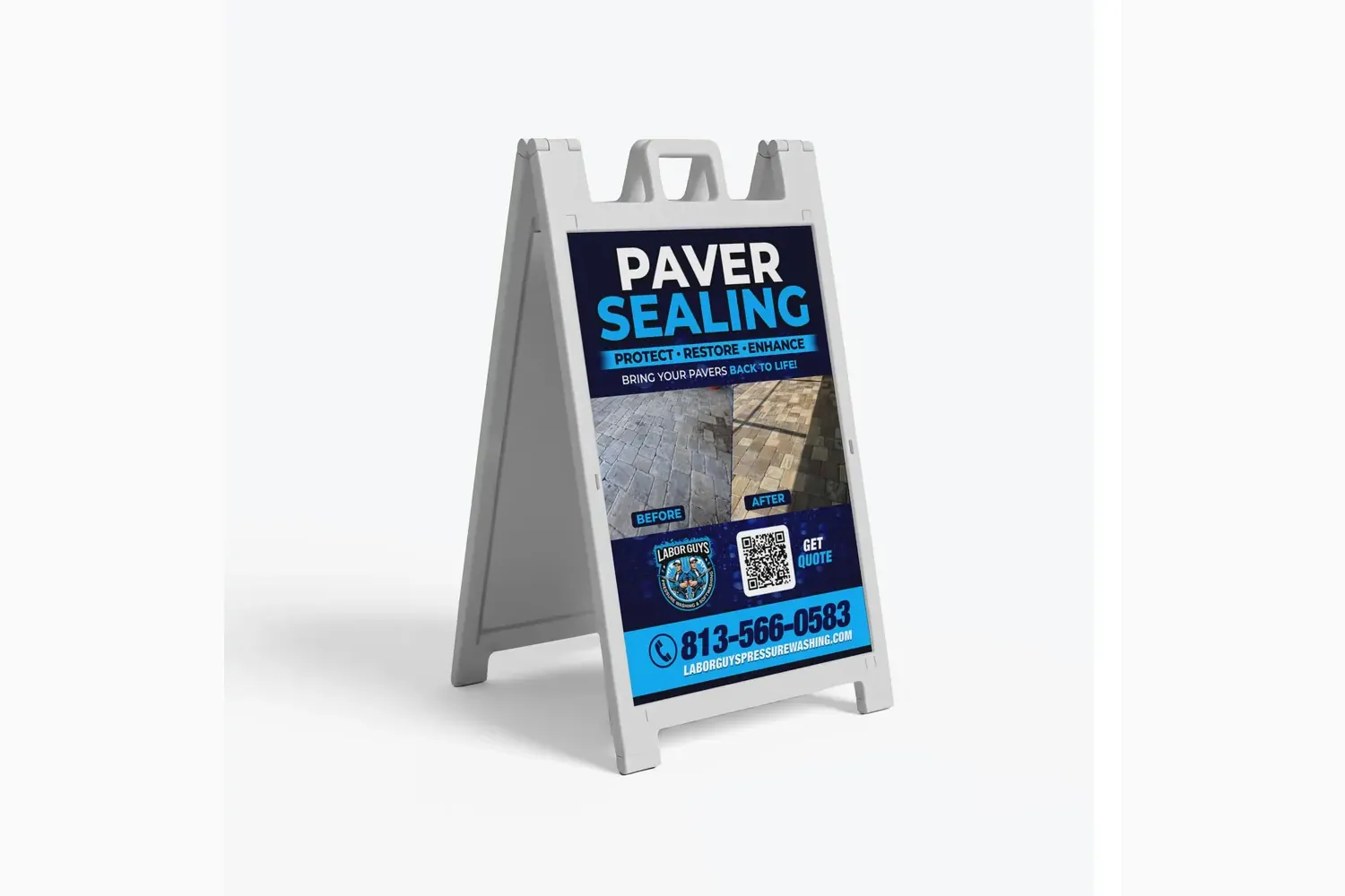
Before-and-after built into the sign itself. For a service most homeowners have never heard of, showing beats explaining.
Websites from $699, print design from $100. Tell us what you sell and the build can start today.
